
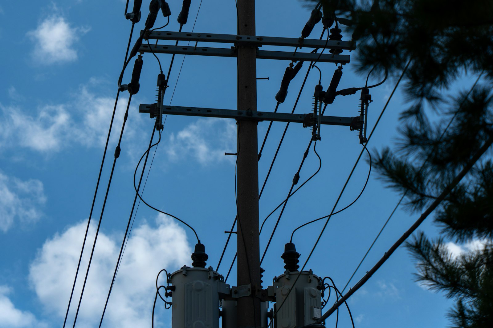
What hosting capacity actually measures
Hosting capacity is the amount of distributed generation a specific point on the distribution system can accept without violating the utility's planning criteria or requiring upgrades. It is expressed in MW or kW at a feeder, a feeder segment, or a node. The value is not a physical constant. It comes from a power flow model with incremental generation added until some limit is crossed, and the first limit crossed sets the number.
Two variants matter. Generation hosting capacity describes how much DG can export at a location. Load hosting capacity, published separately by some utilities, describes how much new demand the same location can serve. Standalone storage sits between the two: it exports when discharging and draws when charging, so a battery is screened against both values, and the tighter one usually governs. The value also depends on the assumed generation profile, so read the utility's methodology document before comparing feeders.
The four limits that set the number
Thermal limits are the simplest: conductors, transformers, and regulators have current ratings, and reverse flow from DG can push a lightly loaded segment past its rating even when peak load never did. Voltage limits usually bind on long rural feeders. Injected power raises voltage at the point of interconnection, and service voltage must stay within the ANSI band, so a feeder with thermal room to spare can still be red because of voltage rise.
Protection limits cover the coordination of fuses, reclosers, and relays. Enough DG on a feeder can desensitize protective devices, feed a fault from the wrong direction, or cause nuisance tripping. Fixing that often means new relays or direct transfer trip, which is expensive relative to a small project and can make an otherwise open feeder uneconomic.
The last is the direction of power flow. Once generation on a feeder exceeds its minimum daytime load, power flows backward through the substation transformer. Some banks tolerate that, others have regulators or load tap changers that misbehave under reverse flow, and many utilities cap aggregate DG near minimum load for that reason. A map value that stops at the feeder's minimum load is usually telling you reverse flow is the constraint.
Why maps are snapshots and how they go stale
Every hosting capacity map is computed from a model of the system as it existed on a particular date. Refresh cadence ranges from monthly to annually and is often set by regulatory order rather than by how fast conditions change. Between refreshes, the map does not know about new interconnections, reconductoring, a substation upgrade that went into service, or a large load that closed.
Staleness is worst in the places developers care about most. Feeders that show generous headroom attract applications, and those applications consume headroom in the order they enter the queue. By the time a refreshed map shows the feeder as constrained, the projects that constrained it may have been submitted months earlier. Maps also reflect normal switching only, so a study run during a seasonal or maintenance configuration can contradict the map without either being wrong.
Reading color bands, feeder values, and nodal values
Most maps use a color band or a numeric range per feeder or segment rather than a single point value. A feeder colored in the top band does not mean the top of the band is available. It means the model found no violation up to the lower edge of that band and stopped reporting detail above some threshold. Assume the lower edge until a pre-application report says otherwise.
Granularity differs between programs. Feeder-level maps report one number for the whole circuit, which hides how capacity changes along its length. Nodal or segment-level maps, such as the California integration capacity analysis, report values along the line so you can see capacity fall off with distance from the substation. With only a feeder-level number, treat distance from the substation as a separate risk factor.
States with maps published under a regulatory program include California, New York, Massachusetts, Minnesota, and several others, but depth varies widely, from nodal values with downloadable data to substation-level estimates once a year. Investor-owned utilities are more likely to publish than cooperatives and municipals, which leaves large rural areas with no map at all.
The headroom the map does not show: the queue
A hosting capacity map typically reflects interconnected generation and sometimes approved projects not yet built, but rarely the full queue of pending applications. Pending projects hold their position and consume capacity when they reach a study. Three pending projects on a green feeder can exhaust it before your application is scoped, and the map will not show that until the next refresh at the earliest.
The practical fix is to cross-reference. Most utilities publish interconnection queues, and many state programs require it. Match queued projects to the substation or feeder in the map, sum their nameplate against the mapped headroom, and discount the map accordingly. Where the queue is not published by feeder, county permit records and site control activity are imperfect but useful proxies.
Combining maps with pre-application reports
A pre-application report is a paid, non-binding data request that returns feeder-specific information for a proposed point of interconnection: substation and feeder identity, nominal voltage, existing and queued generation on the circuit, peak and minimum load where available, and known constraints. The fee is modest relative to a full study and turnaround is typically measured in weeks. It replaces the model estimate with utility-reported facts for one location.
The order matters. Use the map to eliminate sites that are clearly constrained, then spend pre-application fees only on the survivors. The report answers questions the map cannot: how much queued generation is ahead of you, whether the substation transformer tolerates reverse flow, and whether the feeder was recently upgraded or is scheduled to be. Reports age too, so refresh before committing to site control.
Siting community solar and BESS with hosting capacity
Community solar projects are almost always distribution-connected and sized from a fraction of a megawatt to the low single digits, so hosting capacity is the first gate. Screen for headroom above your planned AC output plus margin, short distance from the substation, three-phase service to the parcel, and a substation bank with no reverse-flow restriction. State program rules add overlays, such as caps per feeder or substation, that further reduce usable headroom.
Standalone storage inverts some of the logic. A battery that charges midday and discharges in the evening can relieve peak loading and voltage rise instead of causing it, so a feeder that is red for solar may be workable for storage under an operating schedule the utility accepts. Load hosting capacity governs the charging side. Because most maps model DG as a fixed export profile, storage is where the map is most likely to be pessimistic.
Common misreadings
The most common error is treating a color as a commitment. Green means the model found no violation under the assumptions used; it does not mean the utility will approve a project, and it says nothing about cost if upgrades are needed anyway. The second is reading the top of a band as available capacity. The third is ignoring the difference between generation and load hosting capacity when siting storage.
Developers also misread aggregate values. A substation showing a large number may be the sum of several feeders, none of which individually hosts your project. A feeder value taken at the substation says little about a parcel fifteen miles out. A map that has not refreshed since a large project interconnected describes a system that no longer exists, and a single snapshot hides the trend: a feeder that lost headroom in each recent refresh is worse than its number suggests.
A step-by-step screening workflow
Start with land, not the grid. Filter parcels on size, slope, zoning, wetlands, and distance to three-phase distribution, because a perfect feeder next to an unbuildable parcel is worthless. Then overlay the hosting capacity map and eliminate any candidate with no published headroom at your target size. Record the map date and methodology version for each survivor.
Next, pull the interconnection queue for each surviving substation and subtract queued nameplate from mapped headroom. Rank survivors on adjusted headroom, distance from the substation, and whether the constraint type is one that upgrades fix cheaply. Order pre-application reports for the top handful and re-rank with the reported facts. Only then commit to site control and a formal application, sized to what the report supports rather than what the map implied.
Repeat the map and queue check whenever a refresh lands, because the ranking can change while you are still negotiating land. Modern screening tools, Basepoint among them, aggregate maps and queues across utilities and track change history so this loop takes minutes rather than a week per region.